Success Story
A Scalable Information Design System for Enterprise Data Visualization
Scalable System to unify visualization practices
SECTOR: Financial Services, Energy & Utilities | COMPETENCIES: Design System Management, Data Visualization

CONTACTS

Nina Corradini
Sales and Marketing Director @The Visual Agency
CHALLENGE
The Fragmentation of Data Ecosystems
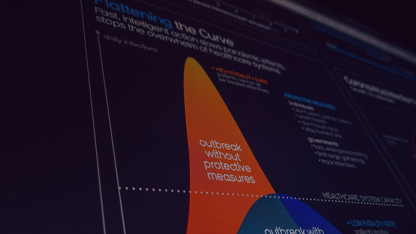
Data‑intensive organizations increasingly rely on complex and heterogeneous digital ecosystems to analyze, communicate, and act on their data. Business intelligence platforms, dashboards, digital products, and reports often coexist without a shared visual or methodological framework. Over time, this fragmentation generates visible structural issues: dashboards differ significantly from one department to another, visual languages vary across Power BI, Tableau, and proprietary platforms, and accessibility requirements are applied inconsistently.
Despite growing levels of data maturity, data communication remains largely ungoverned. Visualization standards are interpreted independently by teams, leading to repeated redesign efforts, poor readability for non‑expert users, and uneven compliance with accessibility standards such as WCAG. As a result, trust in data outputs weakens and the brand experience becomes inconsistent.
Several major organizations and public entities needed a scalable solution able to unify visualization practices across teams and tools, align data outputs with evolving brand identities, improve accessibility and inclusivity, and support future growth without increasing complexity or inefficiency.
OUR SOLUTION
Integrating Design with Information Logic
To address these challenges, The Visual Agency designed a Design System integrated with an Information Design System, specifically tailored to data visualization and dashboards. The system was developed and refined across multiple enterprise and public‑sector projects, allowing it to evolve progressively while maintaining a consistent methodological foundation.
The work began with a structured analysis of the existing ecosystem. Dashboards, reports, and infographics were audited to identify inconsistencies, inefficiencies, and accessibility gaps, while BI tools such as Power BI and Tableau were reviewed to understand real operational workflows. This analysis provided a clear picture of misalignments between brand identity, user needs, and data practices.
From this foundation, a shared set of guiding principles was defined, centered on clarity, hierarchy, simplicity, accessibility, brand coherence, and long‑term scalability. These principles were not treated as abstract values, but systematically translated into practical, repeatable rules.
Both the Design System and the Information Design System were built starting from real users and real use cases. The result was a systemic framework capable of turning high‑level principles into concrete decisions about layout, color, typography, interaction patterns, and data visualization logic.
RESULTS
Accessibility-First Dashboard Interfaces
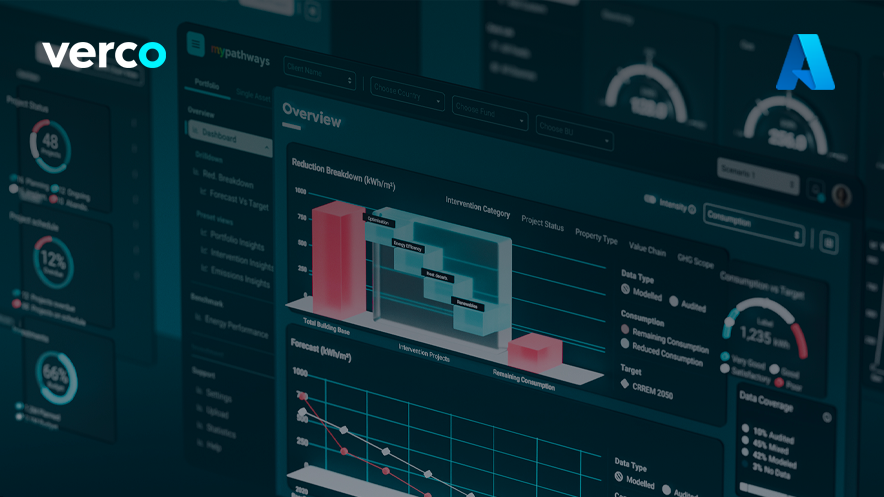
The projects resulted in a documented, modular ecosystem that supports every stage of data communication across digital products. At the core of this ecosystem is a unified Information Design System defining how data should be structured, visualized, and interpreted, including chart usage rules, narrative hierarchy, labeling conventions, layout logic, and data density standards for different audiences.
This system was integrated with a broader Design System for dashboards and interfaces, covering color systems, typography, layout grids, UI components, and interaction patterns. Particular attention was given to accessibility, including research and development on color palettes suitable for users with color blindness or low vision.
A BI‑ready component library was also created, enabling teams to reuse standardized visual components directly within Power BI, Tableau, and other analytical environments. To ensure consistency over time, the entire system was thoroughly documented, transforming design rules into a governance tool rather than a static guideline.
Finally, training and enablement programs were introduced to support adoption. Teams were trained in data visualization best practices and dashboard design techniques, while existing dashboards and reports were progressively updated to align with the new standards.
BENEFITS
Conclusion
The Information Design System evolved into a strategic organizational asset rather than a design deliverable. It now acts as a scalability enabler for business intelligence and digital transformation, a governance layer for data visualization quality, and a shared framework connecting design, technology, and business teams.
By embedding clarity, accessibility, and consistency into everyday tools, data visualization shifted from being a source of fragmentation to a stable foundation for decision making, communication, and future growth.
Customer Stories


Get in touch
Milan, Italy | BIP xTech Head Office
Torre Liberty Building
Galleria de Cristoforis 1, Milan, 20121